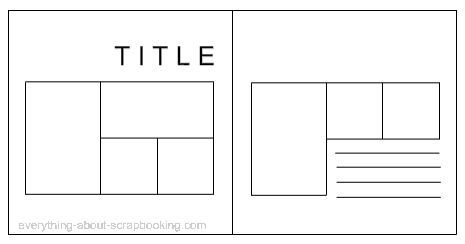
If you haven't used a sketch before, it is basically a plan on how to set out your page. It gives you a guide on where to place your photos and your title and perhaps your journaling too. So, the obvious advantage is you don't have to think about where to put things on your page. But then you can add as much as you like in addition and make it your own really easily.
A couple of months ago I created a double page layout from a sketch for a class on using sketches, and this is a perfect example of taking a sketch and making it mine.
 So first we start with the sketch. This one is from a website everything-about-scrapbooking and there are lots more where this one came from so go check it out if you need a starting place. But throw "scrapbook sketches" or something similar into google and you will get many sites to visit! (Perfect for a rainy Saturday, and our very own Kaiser Craft put up a new sketch every Saturday on their blog so there is another one to check out.)
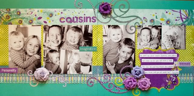
As you can see the sketch is not spectacular to look at, and it is not supposed to be. It is after all just a plan, a starting point if you will. So with a little fiddling and selection of photos and papers and of course adding my own "flair" I finished with this:

As you can see, I added things to dress it up. I started with background papers behind my photos, then added lots of flourishes and flowers to finish off. If there is no suggested placement for embellishments on your sketch remember the "visual triangle" rule of design. This basically means lay your embellishments out in three places around your page so you create a triangle to draw the viewers eye around the page. You can see that I have done this with my flourishes and flowers.
So my finished layout looks quite different from the "plain" sketch that I started with, but you can see the basic placement of photo, titles and journaling are true to the layout of the sketch.
So what are you waiting for? Go and play with a sketch today!
One last thing, a reminder that you only have 4 days to get your colour challenge layout linked!


0 comments:
Post a Comment