
Hello on this fine Thursday morning. Thought I would drop by and share with you some of the delicious new Crate Paper Restoration collection. This collection is absolutely gorgeous and so versatile too. It has a feel about it that would work with vintage photos, but it is still fresh and funky enough that you could use it with newer photos, boy or girl! Can't ask for more than that!
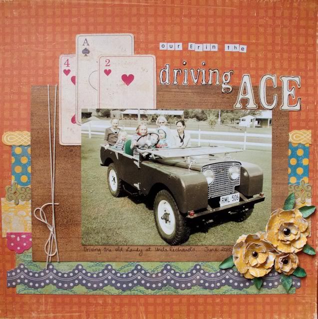 Crate Paper Restoration papers, Restoration border stickers, Kaiser Craft alpha stickers, Slice and Just Chillin design card, Distress Inks - Pine Needles Vintage Photo Old Paper, Tim Holtz Tattered Florals Die
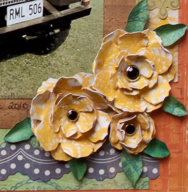
Have I told you about my favourite Sizzix die? Well it would have to be Tattered Florals from the Tim Holtz Alterations range. This die has four different sized flowers and three of them are perfect for layering and creating your own dimensional flowers, while the fourth one is perfect to cut up and use for leaves!
So this is what I have done with my yellow flowers. I have used the smaller two flowers with two of each size for the bigger flowers seen, secured with a bling brad and then four layers of the smallest flower for the small one. Just layer and off-set them and curl up the petals to create great co-ordinating flowers for your own project. The leaves came from the largest flower, but I inked them with Pine Needles distress ink to make them stand out a little more against the same patterned paper in the background! Easy!
So this is what I have done with my yellow flowers. I have used the smaller two flowers with two of each size for the bigger flowers seen, secured with a bling brad and then four layers of the smallest flower for the small one. Just layer and off-set them and curl up the petals to create great co-ordinating flowers for your own project. The leaves came from the largest flower, but I inked them with Pine Needles distress ink to make them stand out a little more against the same patterned paper in the background! Easy!
 And while we are on the topic of distress ink I have used a mini mister spray bottle with Vintage Photo re-inker and a touch of Heirloom Gold perfect pearls to spray the background of my photo mat. This added some interest without adding any bulk! I also used Old Paper ink on my title which was cut from smooth white cardstock using my Slice. I used the ink to age the letters to look a little like the playing cards, and along similar lines outlined the letters too.
Well, that about sums up this page for you. Check out this great range for your next project!
Catch you next time.


